As the RA was very busy and my ticket was timed, I took a wander down Cork Street to see what was going on. First stop was Flowers, where there was a survey of Claerwen James' portraiture, which was fresh to me and which I found to be quite captivating. Aesthetically, James' palette is very appealing to me while the flat, graphic delivery of the paint onto the surface really sings. They retain a painterly quality all the while, however, which is perhaps achieved by the use of oil on board. Conceptually, the paintings evoke a mysterious sense of stillness and unease, created by using photographs as a basis for the works. In the press release, the artist is said to believe that the photographs are "crucial to the painful, elegiac quality of the paintings."
 |
| Claerwen James, "Barefoot girl in yellow", 2006 |
Next I had a peek in Redfearn Gallery a few doors down, where there was a mixed exhibition of painting, print and collage. Small scale works that caught my eye were by John Minton, Patrick Proctor and Keith Vaughan, while at the other end of the scale was an eye-catching drawn piece entitled "Head" [1965] by sculptor Elisabeth Frink.
The current exhibition at Browse and Darby is of work by Patrick George, who deals mainly in landscapes. While his painting style is effective and precise, really I was impressed by the works on paper which displayed great levels of draughtsmanship and technical expertise. On display were studies of people, animals, boating scenes which were all of an extraordinary quality.
 |
| Patrick George, "Dining room chair" |
 |
| Paula Rego, "School for little witches", 2009 |
At last I made it inside the Royal Academy, where "Manet: Portraying Life" was proving to be very popular. I made notes on several of the paintings, with particular reference to their technique and style over any other aspect. The paintings of his wife, Suzanne Leenhoff (Mme. Manet) were interesting because of their rapid and vital direction. It is suggested that their unfinished state indicates that they were not intended for public exhibition. Furthermore, "Woman with a cat" gives an indication of Manet's way of working; the rushed, 'sketchy' piece features long, zig-zag brushstrokes which suggest a kind of crosshatch technique to Manet's underpainting. There is a strong physicality to many of the works on display, the markmaking evokes a sense of intense creativity and it is easy to picture Manet as a fervent and passionate artist at work. In contrast; the more finished, official-looking paintings lack the life-force and immediacy of the aforementioned works. I appreciate the opportunity to see the artist's process; Manet is presented as a painter of enormous imagination and vivacity.
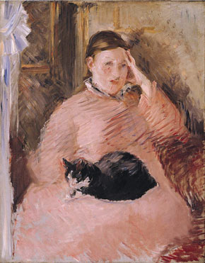 |
| Edouard Manet, "Woman with a cat", 1880-2 |
 |
| Humphrey Ocean, "Felix", 2007 |
Overall, the day was unexpectedly informative to my practice, and I gained a good insight into the current practices of artists I hadn't expected to before.