26/12/2012

Some questions for Laurence Elliott

One artist that caught my attention at this years' Modern Alchemists exhibition was Laurence Elliott. A graduate of Glasgow School of Art, his captivating paintings are a self-deprecating saga of life events and political and social subtext. I wanted to ask him a few questions about his work - below is the correspondence. Laurence's portfolio is available here.
 
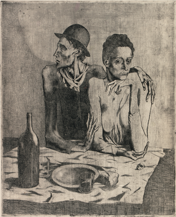
'As above, so below' by Laurence Elliott
 
Ruth Hitchens: Is there a rigid process to your work? Do you follow any sort of cursory procedure in order to create paintings?
Laurence Elliott: I basically do what I think most painters and illustrators do. I have an idea and try to keep it as visually simple as possible, but I'm following 11 years worth of tailored new years resolutions which mean that there's more readings there for anyone who pays proper attention and for me to be thoroughly entertained during the sometimes many years struggle to birth these things. 
I try to draw everything on poor quality paper in marker pens, so that I'm left with dots where my hand pauses. I find this very helpful because it means the work can be farmed, combined, etc. [see below.] I always try to have a few drawn versions of anything before I'll think of painting anything. It rarely works the other way round. It has to be funny & serious. I test them out in a range of drugged, low blood sugared and drunken states, to see if I was lying on any level and to see if they'll inspire lyrics. I've got to get my kicks, or how the hell can anyone else!?!

 
'We all fight the grief' by Laurence Elliott
 
R.H: In your portfolio you mention plundering source material from everywhere, are there any particular places or people that have become a part of your work?
L.E.: Of course. I collect a true current crime magazine from Glasgow called the digger and try to find images of the gang that tried to kill my flatmate that God helped me stop and eventually get the money for this laptop. My friend James Dick is a brilliant portrait painter, so when he heard of my fight with the law over my attempted murder, he willingly gave me photographs of Glasgow's procurator fiscal. I use old photographs of myself and family. Myself, because I like the idea of documenting the decay & fall of a 'golden boy'. 
I collect pictures of Jordan's family, real people magazine, Jade Goody & TV drama actors, particularly Ian Beale at Pauline's funeral.
 
R.H.: How was art school? Did you feel the need to shake the experience off when you graduated?
L.E.: Art school was brilliant for finding the people I needed to know. It's an industry. I want to teach because I know my stuff and imagine it'd be mutually beneficial. When I was in 2nd year (3rd in Scotland), Transmission gallery put me in a group show which meant all the other ambitious collegues of mine turned on me with some real venom. When I realised that I'd probably never be able to pay my loan back because of taking it all very seriously and also in jest, there were things I wanted to shake off, but there's a lot I miss about it.

'Crossing the brook' by Laurence Elliott
R.H.: How has this year compared to previous years in your practice? Where can you see it going?
L.E.: This year was good for making work, and it was the latest. Thats all I can really say. I need a studio and have just gone self-employed, aiming to screen print hoodies and t-shirts and make money from several chasm's I see in the market. I've got favours to call in from various publications. When Xmas is over and I've done all the paperwork I need to do, get a studio and paint again. I've been concentrating on getting my new zine book together and preparing a lot of drawings to become print. Writing songs. It will go further, but I expect many more years crippling poverty. But am REALLY PSYCHED & PUMPED about what I plan to do.

R.H.: What's your outlook for the future of painting and fine art?
L.E.: Such a lot obviously depends on the economy. I just want people to be serious about their fun in this field. For years I've been aching and wishing for the most extreme form of everything mutated together in a dirty rich broth. That nourishes the soul and sense of humour. It's what my efforts have been based around for a long time. Technologically speaking I think it could be really exciting with new print technologies, techniques and methods, holograms and projected sounds so a few individuals think they're going nuts & act up.
I want the wars to stop, especially the war on drugs and that money put into culture. If that happens, it'll be really thrilling but I think people swallow the towed line waaaay too easily and the power is vain and proud and not really concerned, I feel.
 
With thanks again to Laurence for his time, I'll be interested to see what follows.

21/12/2012

Phil Collins at Artes Mundi 5: Critical review


Out of the seven artists nominated for this year’s Artes Mundi prize, Phil Collins is the only Brit on the shortlist. However, his endeavours are as international as any other, as shown by the work he has produced for the exhibition, and his profile as an artist. Collins has shown work across Britain, Europe, Australia and the US and shows no sign of slowing pace.

The Cardiff-based prize is in its fifth year, having established itself as a visual arts initiative aiming to “provide an opportunity for wider discussion of the role of artists in society.” Other artists represented in the prize this year are Teresa Margolles, Tania Brugera, Miriam Bäckström, Apolonija Šušteršic, Darius Mikšys and Sheela Gowder. The works on show span enormously in their formal differences, however a thread of social engagement runs through all of the selected pieces. Collins’ part in Artes Mundi is perhaps one of the more traditional - if such a term still applies - forms of contemporary visual art.

Born in Cheshire, the now Berlin-based artist has put forward two pieces for the prize, installed across two sites: free fotolab is an automated slide projection based in the contemporary gallery of the National Museum Wales, and This Unfortunate Thing Between Us (otherwise abbreviated to TUTBU) is a video installation at Chapter Arts Centre in Cardiff.

Free fotolab began in 2004 as a curatorial project in Milton Keynes. Collins offered a service to the public to develop their 35mm films in exchange for the right to use them any way he saw fit. This element of voyeurism is crucial to the work; without it, Collins is just a lab technician at Jessops (as he once was).  The project went on to expand and exhibit across Europe, and the resulting slide installation in the Museum is a culmination of years of processing, analysing and archiving.

The premise of free fotolab is to question the reproduced image; Collins is probing the boundary between the ownership of these images and the exploitation of the subjects within them and their original creator. They are surrendered to Collins willingly by the original author, to be appropriated as he sees fit, therefore the slideshow before us is not made up of covert or found photographs, but of images selected for a special purpose. Accordingly, the images presented in free fotolab are evidence of the beauty of the snapshot and perhaps even the fragility of human interaction. As an audience, we marvel at the mystery of them: who took the photograph, where and when it was taken, why was it selected? These questions shroud the piece in a nostalgic presence, which at best appeals to aesthetic conventions, but may be considered to conceal the meaning of the piece.

Accompanying free fotolab for Collins entry is This Unfortunate Thing Between Us, a two-part recording of a scripted teleshopping channel, broadcast in Berlin last year on live television. The recordings are shown on screens in two caravans parked outside Chapter. TUTBU tv is a parody of consumerism, where the viewer has the option to purchase one of three life experiences: the chance to be interrogated, Stazi-style, on live television; to play a part in a period-drama sex scene; or to wake up on your deathbed and tell your loved ones exactly what you think of them.

It makes for compelling viewing. Beneath the comedy and quirkiness of the actors garish costumes and wigs, there is an underlying sense of commercially-tinted unease. Collins dissection of the teleshopping format brings the issue of modern desire to question in an explicit and demanding way. Although it seems that there is no clear, forceful message through the piece, the viewer is undeniably made to consider his or her own agenda in relation to it.

Of the two pieces, TUTBU is probably the more revealing of Collins motives as an artist; his practice is highly referential to popular visual communication and in particular, the television programmes which utilise reality in their production inform the work in several ways. We are confronted with a hyper-real version of the everyday, prompting a heightened consciousness of our own lives. Now Phil Collins asks: is this what we have become? More specifically, he asks: how does the camera produce us? By using television as a way to propose opportunity, Collins engages with the notion of communication as an art form. This is nothing especially new to the arts scene, and Collins has been leading to this for several years, however the platform on which the work is distributed offers a different way of thinking through seeing. In the work we discover ourselves, and our own experience of human joyousness, suffering, indifference - Collins does not put a name on it, but offers us its meaning instead.

The key motive that forms the basis of his work is the investigation of human behaviour under the influence of contemporary media. Speaking recently at the Artes Mundi conference at the National Museum, Collins revealed a little more about the works: “snapshots were referred to in derogatory terms but they were remarkably beautiful to me … the centrality of an object which holds an account of memory [is] related to trauma and life experience. What are the modes of address in which we record emotional landscape?” It appears that Collins, as an artist, is oriented towards the mediums that document life itself.

Regardless of winning the £40,000 prize awarded for Artes Mundi, it appears that Collins will inevitably gain a wider audience through his populist approach. Screening TUTBU live on German television has made him a name in the arts scene there, and with the Artes Mundi prize coinciding with the more recognised Turner prize this year (which he was once short listed for) perhaps this will be a year to remember for Phil Collins.

19/10/2012

A brief look at Pop art and its place in contemporary society


This is the transcript of a presentation I gave for an Art History and Theory seminar.

How might we compare window shopping and visiting a gallery? Is there an association between Gallery and Supermarket - and which is the modern place of worship in our secularised society?


There are, of course, differences that set the two apart - the factor of affordability of the items on show or on sale; also the accessibility of such objects to the ordinary person and, to an extent, even the value of their inflation. However, it also seems that the Shop and the Gallery have much in common.

You might walk past a Shop and be see a beautiful coat, or you might be awestruck by a painting in a Gallery. But equally, your response could be of utter indifference or even dislike. This, referring to Kant, is the aspect of agreeability, and both Gallery and Shop are domains of agreeability.


Another common feature between the two is the presence of visual language and, perhaps more importantly, visual communication. The shopper-viewer uses their own visual language to differentiate between goods and artworks, and based upon their tastes and beliefs, they determine a judgement of quality, value and aesthetic appeal.

Visual communication is key to the way both shop and gallery are presented. We find objects and goods in an orderly, considered way. In the case of shops, this is to influence our spending, and in the case of galleries it may be the curators intention to introduce a narrative to a set of works.

This also poses the question: is the consumer more, or less “savvy” than the collector? (Would it be more foolish to pay a thousand pounds for a designer jacket, or for an oil painting?)

Does the Pop art movement celebrate, or deride the phenomenon of mass culture?

You could argue that Pop art, actually runs parallel to modern culture, in such a way that it is both a tribute and a challenge to the mainstream. Pop art emulates reality in a humorous, but also critical way. Claes Oldenberg, it could be said, opened ‘The Store’ in 1961 to facilitate an understanding of the value of production. For instance, the objects he produced were indiscriminate in their subject matter: cake, clothes, burgers – the common denomination is just that they could be bought, by the average consumer.


There is an ongoing fascination with the business of mainstream culture. Is the work produced by an artist comparable to a print made by a machine (look at Andy Warhol's "200 One Dollar Bills")? Do original works have more value than their reproductions? The answer in most cases - if not all cases - is ‘yes’. But does it depend on how many reproductions are made? Again, it seems, ‘yes’.

How do we define Pop art as a movement?

Pop art is not as whimsical as we might think. It is responsive to the absurdity of our shifting society in the past century or so. This is not to say that it has not benefited from the powerful mass communication that has existed since the turn of the 19th century.

Strictly speaking, its roots go much further back than the 1950’s and ‘60’s “hey-day” of Robert Rauschenberg, Jasper Johns and co. It existed before television or radio, and it could be said that since the advances of the industrial revolution, society as a whole has been immersed in mass, communicative culture.


However broadly you might associate them with the movement, many great artists have utilised popular mass media for their own gain. From Dada newspaper collages to Toulouse Lautrecs theatre posters, an engagement with mainstream culture largely exists in modern art. High art is not excluded. Van Gogh once wrote of a caricature he admired, praising: If such thing is possible, it has even more sentiment than Holbeins Todten tantz! He was referring to a John Leech cartoon of Tsar Nicholas on his deathbed, published in Punch magazine.

So to concludePop art, by its broadest definition, has been touched upon in post impressionism, cubism, futurism, abstract expressionism, and it continues to do so in contemporary art.

It is not an inclusive movement, but rather runs alongside modern art and weaves a dialogue in and out of it.

Phil Collins: "This Unfortunate Thing Between Us" at Chapter (invigilation)

I really enjoyed this bizarre, immersive video installation. Previously I shunned video as an enjoyable form of visual art; I've never felt at ease standing in front of a screen in a gallery space with a pair of headphones on. This work, however, is shown in two caravans parked out the front of Chapter, with a cosy atmosphere inside that welcomes the viewer and supplants their curiosity with a feeling of bemusing nostalgia.

The piece is part of Collins' participation in Artes Mundi 5, alongside other work showing in the main exhibition at the National Museum Wales, in Cardiff.

Admittedly, most visitors were inclined to stop only for a few minutes, or even just poke their head, whimsically, around the door; maybe the subtitled German makes it a little unapproachable to the passive viewer, or perhaps an hour is too long to dedicate to a (relatively) little-known artist. Perhaps I would do the same had I not been voluntarily invigilating for the evening. However, after a brief read of the piece's description and a first watch of the entire piece, I was fascinated by its concept and production.


In the context of the caravan installation at Chapter, we are shown a recording of the original live screening of 'TUTBU TV' in Germany last year. The piece parodies the genre of the teleshopping channel, as we are confronted by the salesperson-presenters, live callers and displays of the 'products' on sale. Also provided is a Muzak-style soundtrack by Gruff Rhys and his band Y Niwl.

The premise of the TV station is to sell 'life experiences' at the knock down price of 9.99€ (discount available for students and the unemployed, of course), turning memorable moments into commodities for the couch-surfing consumer. On offer is the chance to tell your friends and family how much you hate them while on your deathbed, a live Stazi-style interrogation and - most sensationally - the chance to star in your own Period-drama graphic sex scene.


It's all highly comedic; there is a live studio audience and the actors, their scripts and even their costumes exude a sense of self-deprecation that is hard not to enjoy. We might see it as modern-day, mass-market escapism but, as the press release goes, perhaps it's actually "a glimpse of what may well prove to be the future of consumerism".

24/05/2012

Affordable Art Fair, Bristol (18/05/12)

Last week I had the good fortune of returning to Bristol to go to the Affordable Art fair at Brunel's Old Station. As a first-time attendee, I was surprised by the overwhelming amount of work on display yet a little mystified by the atmosphere - that of an upper-class cattle market. The lower limit of £40 for artworks was hard to be found, perhaps because art dealers know that the sort of people who attend affordable art fairs do not look for bargains, but instead wish to celebrate their own embourgeoisement in a show of wealth. 


Although there was a lot to see, and in some respects much diversity to the work on show (I was pleased to see wax and resin implemented within the category of painting), I was left jaded at the lack of inventiveness in the majority of paintings. On the whole, I found them to be unsurprisingly commercial and, in most parts, highly generic. This is not to be taken as outright criticism, as it is to be expected at an art fair; the general public are invited to purchase a piece of art for their homes, not a sensational, avant-garde masterpiece. In complete contrast to most of what could be seen at the fair, it is often felt amongst art students and emerging artists that boundaries need to be pushed, albeit in terms of subject matter or media. This does not seem to be true of 'contemporary fine artists' as they are often known. 

While I am always in awe of artists who can skilfully handle egg tempera, or have a mastery of charcoal drawings, or etchings and so on, it is predictable and tiresome to see endless landscapes, women in beautiful dresses, Matisse-alikes etc. The general standard of paintings on show was high, however they possessed such a stylistic appeal that I found it difficult to admire the workmanship.

On a positive note, there was plenty to enjoy about the art fair. The Degree Art stall was a world away from the bustle of high-end art dealers in other stalls, and I really enjoyed Brighton artist Maria Rivans' box-collages a few stalls down. 

Louise McNaught (Degree Art) - Wilder

Sophie Derrick (Degree Art) - Head of O.B.


Maria Rivans - Party Area 2

I also thought that the sculpture on show was incredibly dynamic and offered so much more. Perhaps it is the tactile nature of a 3D object that draws the viewer to it, but I was largely impressed by the range of materials utilised by sculptors in the fair. There was a strong theme of animals, as ever, but each artist seemed to have a highly characteristic approach and an individual take on their subject. Beth Carter's mythological bronze statues were dazzling, as were the amusing Pug 'furnishings' dotted around by Dominic Gubb.

Beth Carter - Cat and Pigeon

Dominic Gubb - Leather Pug


10/05/2012

F.N. Souza


"i can't differentiate good from evil, purity from perversity and all the nice little recipes for human conduct laid out in platitude and sermons and if i could, i'd always choose evil and perversity, hell and brimstone, fornication and corruption."
From the Migrations exhibition at Tate Britain.

London galleries - highlights (08/04/12)

Euan Uglow at Browse & Darby - Radical Clarity
I was lucky to spot a small announcement for this exhibition in Galleries magazine, and the works included really made the visit all the more worthwhile. Having studied some of Uglow's works in college (I had chosen several figurative paintings to reference purely on aesthetics), I hadn't really gained a true understanding of his practice until recently; some of the featured paintings really consolidated my feelings towards the work. 

Euan Uglow - "The Quarry, Pignano", 1979-80

In particular, "The Quarry, Pignano" had been a key influence in one of my A-level projects and I had admired Uglow's use of colour and strong form. However, as with all paintings, it is not until you see it face-to-face that you really grasp the fleshiness of the paint and its application. "Sue Wearing a Blue Swimming Cap" and "Marigold" also caught my eye with their bold composition and subtle line.

Chris Orr at the Royal Academy - Lithorrgraphy
After a wander around the Johan Zoffany exhibition, the smaller Tennant Gallery offered some light relief from Georgian conversational painting in the form of a selection of humourous prints in Orr's seemingly distinctive visual language. I found them engaging for the collage and illustrative elements; also for the childish captions and the overt nostalgia. The imagery largely reminded me of Ladybird children's books (Things to Make and Do, Read it Yourself, etc.)

Chris Orr - "I Want to Dress Up Like a Green Grocer", 2000

I was also very much reminded of a documentary I had watched about Eduardo Paolozzi and his early obsession with collage which of course led to the Bunk! series and more.

Eduardo Paolozzi - "Collage", 1953

Royal Society of Portrait Painters at the Mall Galleries - Annual Exhibition
A highly rich and diverse amount of work was on show here from both established and unknown painters, with an inevitable tendency for realism. With such a saturated market for photorealism in portaiture, the paintings that appealed to me most were a little more experimental with material, media and composition; they just seemed much more characteristic of the individual subject. 

Notable work included:

Malcolm Ashman - "Mask"

Tony Noble - "Portrait of a Man in a Striped Shirt"

Graham Flack - "Elliot II"

Sally Cutler - "Camberwell Heads"

Picasso and Modern British Art at Tate Britain
Several of my favourite works were shown - including "The Frugal Meal", "Girl in a Chemise" and some excellent (and previously unseen) pencil portraits, and I enjoyed the highlights on Picasso's work in theatre design. The general feeling of the exhibition was a little lacklustre for me, but after seeing "Guernica" at the Reina Sofia in Madrid a few years ago, perhaps my expectations were a little high.

Pablo Picasso - "Girl in a Chemise", 1905

Pablo Picasso - "The Frugal Meal", 1904

That said, the rooms that displayed the works of Francis Bacon, Graham Sutherland and David Hockney alongside Picasso's were a pleasant surprise and very informative to me in detailing his respective influence upon each artist. The Hockney prints were a particularly welcome sight.

David Hockney - "The student: homage to Picasso", 1973


23/02/2012

A new "venue"

I have decided to show images of my work on another website, wix.com, where I can display them more professionally and without the heavily chronological style of a blog. It is now live (http://www.wix.com/ruthhitchens/art).

This blog will now become what it is probably more suited to: an online diary of artists and exhibitions I discover and enjoy. It is more for my personal records than for an audience, but I hope the following posts will be coherent and relevant to anyone who chances upon them.

Ruth Hitchens

31/01/2012

Don't Hesitate

"JUST DON'T HESITATE TO EXAGGERATE COLOR AND LIGHT. DON'T WORRY ABOUT TELLING LIES. THE MOST TIRESOME PICTURES ARE THE STUPIDLY TRUTHFUL ONES" - WM MERRITT CHASE

23/01/2012

Life Drawing at Milgi, City Rd. (23/01/12)

After a year-long hiatus from life drawing classes, my interest in form and figure returns.
Click on images for slideshow.


Egon Schiele, 'Nu Assis' (1910)
I am continually fixated with Schiele's bold, linear style. It somehow retains such sensitivity.


Five minute warm-up. Pencil.


Ten/fifteen minute study. Pencil.


A final ten minute study. Pencil.

(N.B.: Aplogies for the less-than-great image quality.)


18/01/2012

Cardiff School of Art, First year 'rotations' (2011/12)

Works within the Fine Art specialisms of Sculpture, Printmaking and Painting.
Click on works to view in slideshow.

PAINTING
Aubergine and sharon fruit. Oil on paper.


Pear and plums. Oil on paper.

Clementines. Oil on paper.


Bear mask. Oil on canvas.

Romany peppers. Oil on linen.

Pomegranate. Oil on linen.

Lemon and clementine. Oil on linen.

Alec. Oil on canvas. To be completed.

PRINTMAKING
Self portrait. Intaglio print.

Dead mouse. Intaglio print.

Walking bears. Chine colle.

SCULPTURE
Shaker light. Steel.

Prototype for a lampshade in paper.