23/11/2013

Modern Alchemists: An Autumn Exhibition

Ever on the beating pulse of emerging art in Cardiff, Modern Alchemists present us with another striking selection of new art in the Capitol Arcade. Here are my personal highlights.

Starting from the entrance, Tuğba Şimşek’s quaint collage series charms with its minimal aesthetic - the coloured mounts and clip frames enhance the hand cut collages superbly.
From Tuğba Şimşek's collage series
Recent works on show by Tess Gray contain an oozing, unnatural palette of colour in bizarrely angular, controlled compositions which makes an altogether discordant view of the world. In her accompanying statement, Gray states that she “attempt[s] to draw out, display and romanticise the feelings of elation and emptiness that accompany reminiscing and daydreaming.” The paintings are certainly effective in that they evoke a sense of confused familiarity in the viewer, portraying once recognisable silhouettes of houses in a perplexing juxtaposition with more abstract elements.
Tess Gray, 'Your street was America' (2013)
Perhaps the largest scale painting in the show is Aidan Myers’ aptly titled ‘Expanse’, an amalgam of dead reds and blacks which leaves flesh-like apparitions in its wake. The piece is a choice example of Myers’ distinctive mark-making, a promising aspect of his recent work. Flanking ‘Expanse’ are paintings by Annie Suganami, of which ‘age+me’ is a true reinforcement of her skill. Recalling the elegiac gaze of Old Masters paintings in her self-portrait, Suganami achieves a pointedly melancholy effect on the canvas, which is strengthened by the reds, greys and blacks of her palette.
Annie Suganami, 'age+me' (2013)

The colour red occurs multiple times in this autumn show, perhaps fittingly for the season. Zoe Hall’s painting, titled ‘The Sound of the Bell’ is a wonderfully vibrant piece with a myriad of powerful elements distilled onto a single canvas surface. She is using music, maths and art to represent the tradition of bell-ringing in an ‘abstract, logical way’, which is achieved with a degree of brilliance through harmonious colour and application of paint.
Tom Cardew's mesmerising and disorientating photographic series.

The combination of fine, figurative lines and three-dimensional typography of Tom Kitchen’s digital illustrations are particularly enjoyable, while in another room Tom Cardew’s series of out-of-focus photographs are somewhat inescapable, with the joyous haze of reverie bleeding into view. Rebecca Floodless’ digital montages of men with animal heads are a comical spin on modern advertising, with the title of ‘The Daily Trudge’ betraying a passive, unmistakably British sense of humour.
Tom Kitchen, 'Let's go' and 'Let's eat', digital prints
In the centre of the warehouse space stands a sculptural piece by Ethan Dodd, made up of lots of little porcelain ‘wombs’ which eventually topple to the floor like directionless Lemmings. Alongside the work, titled ‘Clandestine’, Dodd describes a deep-rooted fear of death about which he claims: “I had also hidden this fear from everyone, including myself, and hoped that the creation and exhibition of this piece would allow me to reveal this great concern.” The dramatic statement gives an altogether solid context to the piece, and while the viewer can only second-guess the authenticity of the accompanying discourse, Dodd’s intentions are surprisingly open and heartfelt.

Lastly, and on an amusing note, I enjoyed reading Tudor Gwynn Suganami Jones’ comic-book illustration, entitled ‘When I made this, I hadn’t been laid in a while…”, and would implore all artists to share the same good-humoured attitude to their work.

Note to featured artists: if you would like me to add a link to your website in this post, or add/replace images of any artworks mentioned, please don't hesitate to contact me.

27/10/2013

Hand of Roath 2013 - Modern Alchemists

The Modern Alchemists have established themselves as a stellar artist collective. Emerging over recent years in Cardiff, they've channeled  an impressive amount of creative energy into curating exhibitions and events. As part of this year's Made in Roath festival, they put together an extensive programme for the week. Aside from their street art festival, Empty Walls, and the Walking Gallery, Modern Alchemists were hosts to 'Hand of Roath' in their newly acquired building on Bridge Street. 
The opening night was on Saturday 19th October, and Ivor House was transformed into a great space to showcase some fantastic art and music. Before discussing the art, the music needs a special mention; there was a wild, wondrous contrast between the musicians selected for the show. The warm-hearted, folk-tinged ditties of Seamus Fogarty's unplugged set were superbly followed by Ginko's atmospheric, instrumental soundscapes. Both performances were wonderfully captivating, and the basement made for a memorable setting.


Seamus Fogarty (image courtesy of Modern Alchemists)
Ginko (image courtesy of Modern Alchemists)
As for the art on display, there are too many artists to mention in one post, so here's a selection of highlights. The show continues until the 9th November, for more information see http://modernalchemists.blogspot.co.uk/

Beginning with a focus on drawing, there is great work on both floors. Upstairs features Bianca Theresa's intricate, engaging pencil portraits on a modest scale, displayed sweetly on a line of string. They appear to blur the borders between reality and fiction, as though the artist has fabricated certain aspects of her subjects' appearance. Downstairs, Sophie Adams' perplexing line drawings are impossible to look away from, similarly featuring surreal, made-up characters such as a reclining human with the head of a cat. With work on both floors, Jo Higgs' colourful, naive drawings of dis-proportioned nudes conjure up a playful, childlike narrative. Back upstairs, there is the discordant work of Laurence Elliott. Here he presents two mixed media drawings in monochrome. Fitting with Elliott's established visual code, the works are at once domestic and scientific, blending the familiar, yet slightly awkward aesthetic of family snapshots with confrontational anatomic motifs - the devil is truly in the detail.


Bianca Theresa's drawings (image courtesy of Joshua Kendall)

Building on the eclectic display, there are a select number of canvases. Matt Redman's work fondly recalls Peter Blake's mixed media pieces to brilliant effect. The slogan 'Grey British' heads the canvas and is rendered, as well as the rest of its surface, in an illustrious, varnished palette of muted greens and greys. Also featured is a small piece by Helen Bur. It is engulfed in mystery; an ambiguous industrial scene is depicted, yet the painterly, organic marks lend the piece an ethereal quality which works to brilliant effect.

Matt Redman's 'Grey British' (image courtesy of Joshua Kendall)

Sculptural works play a key part in the show: Alex Waddell's hand carved figures remember the skilled work of puppeteers and toy-makers from a by-gone era, while Laura Jane Kitts' geometric, leather sculptures are intriguing pieces of craftsmanship - perhaps questioning the use of leather in a seemingly purposeless object. Downstairs, Sarah Younan's impressive ceramic heads are a treat. The process involved in their creation is fascinating enough, but the whimsical, delicate illustrations and text overlaid on the ceramics are curious and thoughtful. Also featured downstairs is Rebecca Wyn Kelly's assemblage of miniature figurines and toys - a flurry of nostalgia and surrealism. The scene is set for some strange, cowboy-vs-Indians, holiday-in-suburbia showdown, and we can only imagine the results of such. Next to this is James Green's latest masked invention: a combination of machismo, Kendo Nagasaki aesthetic and 'here's-one-I-made-earlier' Blue Peter effort, which contrasts brilliantly. The familiar, tribal pattern of the wrestler's mask is offset by the everyday materials used: flannel socks, a fabric sports bag and beads which make for an enthralling piece.

Arron Kupier's painting-sculpture (image courtesy of Joshua Kendall)

Certain work on show is an amalgam of two, occasionally disparate, art forms. Arron Kupier's fascinating painting-sculptures are highly inventive in their construction. The method involves syringing paint into a chamber filled with a gel-like substance, which is surely a painstaking and laborious process, the outcome of which is an unfamiliar, painterly-yet-three-dimensional surface. Another subtle fusion of media is the sharply presented work of Joshua Kendall, who demonstrates his keen eye for colour in a beautiful, vignette style photograph overlaid with simple, gestural smudges of bright turquoise paint. In a similar vein, Colour Doomed's 'defaced' faces of the past are bold, brightly-coloured puzzle pieces of photographic history.

All-in-all, this year's 'Hand of Roath' has been excellently appropriated by the Modern Alchemists, with a wealth of talent featured, going to show that truly wonderful things can be built from the ground up - a massive congratulations to the guys behind the scenes, future output is eagerly awaited!

16/09/2013

Advice to my first year self

I'm going into the final year of my fine art degree very shortly and it's occurred to me that the previous two have completely flown by. It's hard to look ahead when you are starting university. I think that those before me who I've seen succeed have had the wit and wisdom to approach their degree thoughtfully and with a ton of ambition. As I reflect on my degree so far, here's a few pointers I would've given myself if I could:

At the beginning, sign up to anything and everything. Hit the ground running in terms of learning techniques and processes, there are so many workshops available (and you may find that some of them clash, but don't be disheartened by it, just try to repeat it next term or in your second year if you need to.) The technicians provide a wonderful learning opportunity, so use it. Also commit a lot of time to drawing, whatever discipline you are into. Sign up to life drawing workshops and give some real time to sketching regularly, it will benefit you immensely even if you enjoy it or not.

It will also benefit you to sign up for volunteering opportunities at local galleries and art events. This provides you with points of contact for the future, however if you start to think that you are giving too much of your time away don't be afraid to scale it down. The ability to differentiate between a useful opportunity and a waste of time is important.

Before you spend your student loan on anything else, get yourself kitted out. Buy tools, a decent staple gun, craft knives and quality brushes/pencils etc. These will be invaluable to you throughout and you will be so glad that you have your own kit as these items become sacred towards the end of the year. Keep them safe as there are usually certain people who like to "permanently borrow" stuff that's left lying around. 

Try to have a ritual in the studio. It is difficult to be disciplined but if you can get into a pattern of working every day with a few breaks, you'll find that your productivity will soar. Also remember that it's good to actually be seen by your tutors and fellow students - so try to put the hours in during the daytime! Pop your head round other people's studio spaces now and again to see what they are up to. You'll be alongside these people in future exhibitions so get a good working relationship going.

Professionalism is important, at any stage of your degree. Don't confuse professionalism with being overly serious though, as you are liable to come across as a bit arrogant. Be polite, turn up on time and you will be so much more likely to be offered opportunities and included in the important stuff.

Lastly, enjoy every second of your degree. You will probably spend a great deal of time procrastinating, self-doubting, and dramatically sobbing in corners about deadlines, but those hard-to-come-by moments of pure inspiration and solid work are so worth it. 

In the words of Gerhard Richter:
"Now there are no priests or philosophers left, artists are the most important people in the world."

26/02/2013

London galleries: highlights (19/02/13)

I was lucky enough to get a space on the coach last week to London to see the Manet show at the RA. It was fairly last minute so, with no set agenda, I took a Galleries guide and just spent the day on a whim.

As the RA was very busy and my ticket was timed, I took a wander down Cork Street to see what was going on. First stop was Flowers, where there was a survey of Claerwen James' portraiture, which was fresh to me and which I found to be quite captivating. Aesthetically, James' palette is very appealing to me while the flat, graphic delivery of the paint onto the surface really sings. They retain a painterly quality all the while, however, which is perhaps achieved by the use of oil on board. Conceptually, the paintings evoke a mysterious sense of stillness and unease, created by using photographs as a basis for the works. In the press release, the artist is said to believe that the photographs are "crucial to the painful, elegiac quality of the paintings."

Claerwen James, "Barefoot girl in yellow", 2006

Next I had a peek in Redfearn Gallery a few doors down, where there was a mixed exhibition of painting, print and collage. Small scale works that caught my eye were by John Minton, Patrick Proctor and Keith Vaughan, while at the other end of the scale was an eye-catching drawn piece entitled "Head" [1965] by sculptor Elisabeth Frink.

The current exhibition at Browse and Darby is of work by Patrick George, who deals mainly in landscapes. While his painting style is effective and precise, really I was impressed by the works on paper which displayed great levels of draughtsmanship and technical expertise. On display were studies of people, animals, boating scenes which were all of an extraordinary quality.

Patrick George, "Dining room chair"
I was enticed inside Marlborough Fine Art by the fascinating display in the window. Paula Rego was showing "Dame with the goat's foot and other stories", a series of recent works on paper that were based on the curious display: a disconcerting group of lifeless, life-size dolls, humanoids, animals and hybrids were arranged eerily in a group, like the cast of a bizarre pantomime. The resulting pastel-conte-charcoal works follow suit in their creepy, narrative style.

Paula Rego, "School for little witches", 2009

At last I made it inside the Royal Academy, where "Manet: Portraying Life" was proving to be very popular. I made notes on several of the paintings, with particular reference to their technique and style over any other aspect. The paintings of his wife, Suzanne Leenhoff (Mme. Manet) were interesting because of their rapid and vital direction. It is suggested that their unfinished state indicates that they were not intended for public exhibition. Furthermore, "Woman with a cat" gives an indication of Manet's way of working; the rushed, 'sketchy' piece features long, zig-zag brushstrokes which suggest a kind of crosshatch technique to Manet's underpainting. There is a strong physicality to many of the works on display, the markmaking evokes a sense of intense creativity and it is easy to picture Manet as a fervent and passionate artist at work. In contrast; the more finished, official-looking paintings lack the life-force and immediacy of the aforementioned works. I appreciate the opportunity to see the artist's process; Manet is presented as a painter of enormous imagination and vivacity.

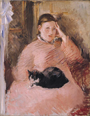
Edouard Manet, "Woman with a cat", 1880-2
After lunch I decided to head to the National Portrait Gallery to have a look at the contemporary wing. I was glad to have gone as it was a great source of ideas for my own work. "Three Royal Court theatre directors" [2004] by Justin Mortimer was a pleasant surprise, as I had not expected to see his work there and have only seen it on paper. Up close the work is captivating and painterly, and of a high quality that I've come to expect from Mortimer. I also got  a glimpse of Marlene Dumas' recent "Amy Blue" painting, which gained a lot of press when it was first shown. It seemed to me to be a rather elementary painting in it's style and the actual canvas was primed with a horrible white which, although deliberate, I couldn't help but dislike the aesthetic of it. There was a room dedicated to Humphrey Ocean's ongoing "A handbook of modern life" series, which I loved. Here he is creating a continuous journal of life experience and encounters with his contemporaries, something which I am currently aspiring to do in my work. Another work which struck me was Maggi Hambling's charcoal study of Stephen Fry [1993]; a highly accomplished and expressive piece which retains a loose, rhythmic effect.

Humphrey Ocean, "Felix", 2007
Finally I made a brief stop at the ICA where Juergen Teller's "Woo!" exhibition was on. The large scale photographs of a nude Vivienne Westwood were surprising and mildly titilating to me, while his series of photographs "Irene im Wald" showed a more personal, reflective side to the unconventional photographer. One room was plastered with spreads from magazines that he'd created, featuring humourous, posed and naked photos of himself, supermodels, designers and celebrities. These were mostly amusing and pleasing to the eye, whereas the more formal photographs upstairs were captivating for their more human, inward-looking style. Altogether the show was light relief after a day of looking at paintings. I wonder why photography is, at times, easier to look at? I don't feel such a need to find meaning or criticism for a photograph in the same way that I do for a painting.

Overall, the day was unexpectedly informative to my practice, and I gained a good insight into the current practices of artists I hadn't expected to before.