Showing posts with label art. Show all posts

27/10/2013

Hand of Roath 2013 - Modern Alchemists

The Modern Alchemists have established themselves as a stellar artist collective. Emerging over recent years in Cardiff, they've channeled  an impressive amount of creative energy into curating exhibitions and events. As part of this year's Made in Roath festival, they put together an extensive programme for the week. Aside from their street art festival, Empty Walls, and the Walking Gallery, Modern Alchemists were hosts to 'Hand of Roath' in their newly acquired building on Bridge Street. 
The opening night was on Saturday 19th October, and Ivor House was transformed into a great space to showcase some fantastic art and music. Before discussing the art, the music needs a special mention; there was a wild, wondrous contrast between the musicians selected for the show. The warm-hearted, folk-tinged ditties of Seamus Fogarty's unplugged set were superbly followed by Ginko's atmospheric, instrumental soundscapes. Both performances were wonderfully captivating, and the basement made for a memorable setting.


Seamus Fogarty (image courtesy of Modern Alchemists)
Ginko (image courtesy of Modern Alchemists)
As for the art on display, there are too many artists to mention in one post, so here's a selection of highlights. The show continues until the 9th November, for more information see http://modernalchemists.blogspot.co.uk/

Beginning with a focus on drawing, there is great work on both floors. Upstairs features Bianca Theresa's intricate, engaging pencil portraits on a modest scale, displayed sweetly on a line of string. They appear to blur the borders between reality and fiction, as though the artist has fabricated certain aspects of her subjects' appearance. Downstairs, Sophie Adams' perplexing line drawings are impossible to look away from, similarly featuring surreal, made-up characters such as a reclining human with the head of a cat. With work on both floors, Jo Higgs' colourful, naive drawings of dis-proportioned nudes conjure up a playful, childlike narrative. Back upstairs, there is the discordant work of Laurence Elliott. Here he presents two mixed media drawings in monochrome. Fitting with Elliott's established visual code, the works are at once domestic and scientific, blending the familiar, yet slightly awkward aesthetic of family snapshots with confrontational anatomic motifs - the devil is truly in the detail.


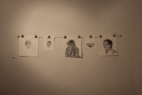
Bianca Theresa's drawings (image courtesy of Joshua Kendall)

Building on the eclectic display, there are a select number of canvases. Matt Redman's work fondly recalls Peter Blake's mixed media pieces to brilliant effect. The slogan 'Grey British' heads the canvas and is rendered, as well as the rest of its surface, in an illustrious, varnished palette of muted greens and greys. Also featured is a small piece by Helen Bur. It is engulfed in mystery; an ambiguous industrial scene is depicted, yet the painterly, organic marks lend the piece an ethereal quality which works to brilliant effect.

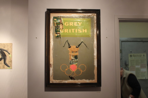
Matt Redman's 'Grey British' (image courtesy of Joshua Kendall)

Sculptural works play a key part in the show: Alex Waddell's hand carved figures remember the skilled work of puppeteers and toy-makers from a by-gone era, while Laura Jane Kitts' geometric, leather sculptures are intriguing pieces of craftsmanship - perhaps questioning the use of leather in a seemingly purposeless object. Downstairs, Sarah Younan's impressive ceramic heads are a treat. The process involved in their creation is fascinating enough, but the whimsical, delicate illustrations and text overlaid on the ceramics are curious and thoughtful. Also featured downstairs is Rebecca Wyn Kelly's assemblage of miniature figurines and toys - a flurry of nostalgia and surrealism. The scene is set for some strange, cowboy-vs-Indians, holiday-in-suburbia showdown, and we can only imagine the results of such. Next to this is James Green's latest masked invention: a combination of machismo, Kendo Nagasaki aesthetic and 'here's-one-I-made-earlier' Blue Peter effort, which contrasts brilliantly. The familiar, tribal pattern of the wrestler's mask is offset by the everyday materials used: flannel socks, a fabric sports bag and beads which make for an enthralling piece.

Arron Kupier's painting-sculpture (image courtesy of Joshua Kendall)

Certain work on show is an amalgam of two, occasionally disparate, art forms. Arron Kupier's fascinating painting-sculptures are highly inventive in their construction. The method involves syringing paint into a chamber filled with a gel-like substance, which is surely a painstaking and laborious process, the outcome of which is an unfamiliar, painterly-yet-three-dimensional surface. Another subtle fusion of media is the sharply presented work of Joshua Kendall, who demonstrates his keen eye for colour in a beautiful, vignette style photograph overlaid with simple, gestural smudges of bright turquoise paint. In a similar vein, Colour Doomed's 'defaced' faces of the past are bold, brightly-coloured puzzle pieces of photographic history.

All-in-all, this year's 'Hand of Roath' has been excellently appropriated by the Modern Alchemists, with a wealth of talent featured, going to show that truly wonderful things can be built from the ground up - a massive congratulations to the guys behind the scenes, future output is eagerly awaited!

26/12/2012

Some questions for Laurence Elliott

One artist that caught my attention at this years' Modern Alchemists exhibition was Laurence Elliott. A graduate of Glasgow School of Art, his captivating paintings are a self-deprecating saga of life events and political and social subtext. I wanted to ask him a few questions about his work - below is the correspondence. Laurence's portfolio is available here.
 
'As above, so below' by Laurence Elliott
 
Ruth Hitchens: Is there a rigid process to your work? Do you follow any sort of cursory procedure in order to create paintings?
Laurence Elliott: I basically do what I think most painters and illustrators do. I have an idea and try to keep it as visually simple as possible, but I'm following 11 years worth of tailored new years resolutions which mean that there's more readings there for anyone who pays proper attention and for me to be thoroughly entertained during the sometimes many years struggle to birth these things. 
I try to draw everything on poor quality paper in marker pens, so that I'm left with dots where my hand pauses. I find this very helpful because it means the work can be farmed, combined, etc. [see below.] I always try to have a few drawn versions of anything before I'll think of painting anything. It rarely works the other way round. It has to be funny & serious. I test them out in a range of drugged, low blood sugared and drunken states, to see if I was lying on any level and to see if they'll inspire lyrics. I've got to get my kicks, or how the hell can anyone else!?!

 
'We all fight the grief' by Laurence Elliott
 
R.H: In your portfolio you mention plundering source material from everywhere, are there any particular places or people that have become a part of your work?
L.E.: Of course. I collect a true current crime magazine from Glasgow called the digger and try to find images of the gang that tried to kill my flatmate that God helped me stop and eventually get the money for this laptop. My friend James Dick is a brilliant portrait painter, so when he heard of my fight with the law over my attempted murder, he willingly gave me photographs of Glasgow's procurator fiscal. I use old photographs of myself and family. Myself, because I like the idea of documenting the decay & fall of a 'golden boy'. 
I collect pictures of Jordan's family, real people magazine, Jade Goody & TV drama actors, particularly Ian Beale at Pauline's funeral.
 
R.H.: How was art school? Did you feel the need to shake the experience off when you graduated?
L.E.: Art school was brilliant for finding the people I needed to know. It's an industry. I want to teach because I know my stuff and imagine it'd be mutually beneficial. When I was in 2nd year (3rd in Scotland), Transmission gallery put me in a group show which meant all the other ambitious collegues of mine turned on me with some real venom. When I realised that I'd probably never be able to pay my loan back because of taking it all very seriously and also in jest, there were things I wanted to shake off, but there's a lot I miss about it.

'Crossing the brook' by Laurence Elliott
R.H.: How has this year compared to previous years in your practice? Where can you see it going?
L.E.: This year was good for making work, and it was the latest. Thats all I can really say. I need a studio and have just gone self-employed, aiming to screen print hoodies and t-shirts and make money from several chasm's I see in the market. I've got favours to call in from various publications. When Xmas is over and I've done all the paperwork I need to do, get a studio and paint again. I've been concentrating on getting my new zine book together and preparing a lot of drawings to become print. Writing songs. It will go further, but I expect many more years crippling poverty. But am REALLY PSYCHED & PUMPED about what I plan to do.

R.H.: What's your outlook for the future of painting and fine art?
L.E.: Such a lot obviously depends on the economy. I just want people to be serious about their fun in this field. For years I've been aching and wishing for the most extreme form of everything mutated together in a dirty rich broth. That nourishes the soul and sense of humour. It's what my efforts have been based around for a long time. Technologically speaking I think it could be really exciting with new print technologies, techniques and methods, holograms and projected sounds so a few individuals think they're going nuts & act up.
I want the wars to stop, especially the war on drugs and that money put into culture. If that happens, it'll be really thrilling but I think people swallow the towed line waaaay too easily and the power is vain and proud and not really concerned, I feel.
 
With thanks again to Laurence for his time, I'll be interested to see what follows.

19/10/2012

A brief look at Pop art and its place in contemporary society


This is the transcript of a presentation I gave for an Art History and Theory seminar.

How might we compare window shopping and visiting a gallery? Is there an association between Gallery and Supermarket - and which is the modern place of worship in our secularised society?


There are, of course, differences that set the two apart - the factor of affordability of the items on show or on sale; also the accessibility of such objects to the ordinary person and, to an extent, even the value of their inflation. However, it also seems that the Shop and the Gallery have much in common.

You might walk past a Shop and be see a beautiful coat, or you might be awestruck by a painting in a Gallery. But equally, your response could be of utter indifference or even dislike. This, referring to Kant, is the aspect of agreeability, and both Gallery and Shop are domains of agreeability.


Another common feature between the two is the presence of visual language and, perhaps more importantly, visual communication. The shopper-viewer uses their own visual language to differentiate between goods and artworks, and based upon their tastes and beliefs, they determine a judgement of quality, value and aesthetic appeal.

Visual communication is key to the way both shop and gallery are presented. We find objects and goods in an orderly, considered way. In the case of shops, this is to influence our spending, and in the case of galleries it may be the curators intention to introduce a narrative to a set of works.

This also poses the question: is the consumer more, or less “savvy” than the collector? (Would it be more foolish to pay a thousand pounds for a designer jacket, or for an oil painting?)

Does the Pop art movement celebrate, or deride the phenomenon of mass culture?

You could argue that Pop art, actually runs parallel to modern culture, in such a way that it is both a tribute and a challenge to the mainstream. Pop art emulates reality in a humorous, but also critical way. Claes Oldenberg, it could be said, opened ‘The Store’ in 1961 to facilitate an understanding of the value of production. For instance, the objects he produced were indiscriminate in their subject matter: cake, clothes, burgers – the common denomination is just that they could be bought, by the average consumer.


There is an ongoing fascination with the business of mainstream culture. Is the work produced by an artist comparable to a print made by a machine (look at Andy Warhol's "200 One Dollar Bills")? Do original works have more value than their reproductions? The answer in most cases - if not all cases - is ‘yes’. But does it depend on how many reproductions are made? Again, it seems, ‘yes’.

How do we define Pop art as a movement?

Pop art is not as whimsical as we might think. It is responsive to the absurdity of our shifting society in the past century or so. This is not to say that it has not benefited from the powerful mass communication that has existed since the turn of the 19th century.

Strictly speaking, its roots go much further back than the 1950’s and ‘60’s “hey-day” of Robert Rauschenberg, Jasper Johns and co. It existed before television or radio, and it could be said that since the advances of the industrial revolution, society as a whole has been immersed in mass, communicative culture.


However broadly you might associate them with the movement, many great artists have utilised popular mass media for their own gain. From Dada newspaper collages to Toulouse Lautrecs theatre posters, an engagement with mainstream culture largely exists in modern art. High art is not excluded. Van Gogh once wrote of a caricature he admired, praising: If such thing is possible, it has even more sentiment than Holbeins Todten tantz! He was referring to a John Leech cartoon of Tsar Nicholas on his deathbed, published in Punch magazine.

So to concludePop art, by its broadest definition, has been touched upon in post impressionism, cubism, futurism, abstract expressionism, and it continues to do so in contemporary art.

It is not an inclusive movement, but rather runs alongside modern art and weaves a dialogue in and out of it.

18/01/2012

School and Sixth Form (2008/10)

A few images remain from work between 2008 and 2010 - the halcyon years of GCSE Art & Design, followed by A-level Photography and Art.
Click on works to view in slideshow.

Above: Acrylic, ink and watercolour over acetate.

Detail from an enjoyable, albeit predictable 'Memories' project. Watercolour.

Detail from an exam piece. Watercolour, acrylic, lacquer and ink on paper.

Above and below: Initial darkroom prints.


Self portrait. Acrylic, 2009

Self portrait. Acrylic, 2009.

Grace. Oil on board, 2008.